Photo notes:
Chris took a photo of Gisele LaVoie, manager of Dulux Paints, who painted tile-patterned wallpaper with a metallic finish to add lustre. The paper would be a great alternative as a backsplash in the kitchen or bathroom.
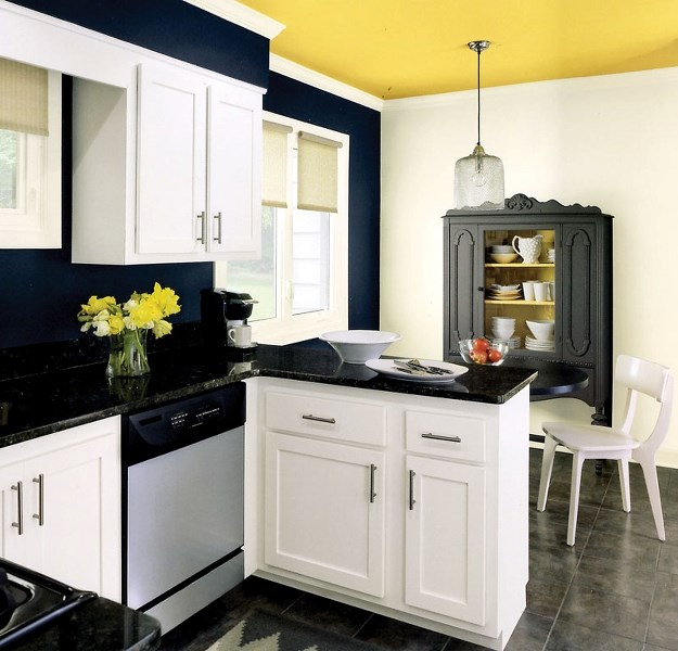
In addition you have a photo of a kitchen with dark blue walls and a yellow accents.
--------
0203sj at home paint
The most fashionable colours reported in magazines and online decorating sites are not necessarily the colours that show up on the walls of St. Albert homes.
Pantone, the American company that each year determines the Colour of the Year, has declared Emerald Green is the fashionable hue for 2013. For what it’s worth, in 2012 the colour was Tangerine Tango and in 2011 it was Honeysuckle.
But as everyone knows, it ain’t easy being green, especially Emerald Green and especially if you happen to be a wall. Just as decorators toned down the tangerines and honeysuckle shades of yesteryear, bright green isn’t a hot seller yet, at least not in St. Albert.
Instead, local paint stores and painters are seeing a different trend this year as it seems St. Albert’s populace is going back to painting their homes with more neutral shades of beige, grey, soft yellow and even good old off-white.
“I did paint one house with a burnt-orange colour last year, but they had antique furnishings and it went well with that style,” said JoAnn Schmidt of Joey M Painting Ltd. “But this year I’m seeing a trend back to off-white for the main part of the home. It’s still beige, but it’s lighter than taupe. It’s nice because it’s so clean and white looking.”
Many of her clients are reserving the intense colours for the bathroom and bedroom walls, Schmidt said.
“It’s strange because the bathroom is usually small but somehow it’s very elegant to have darker colours in a bathroom,” she said. “I just painted a chocolate brown half-bath for a couple.”
Using deeply-coloured rich tones in a home can be tricky if there are small windows or if the home faces north. The jewelled tones look attractive with hardwood flooring, but may also appear to darken a home.
“Trends come and go but you have to live with the colour for a long time. It depends on the light you have in the house. It’s easier to get away with those darker walls, say on a feature wall, if you have big windows,” said Gisele LaVoie, manager at Dulux Paints.
For added texture many people are papering their walls and ceilings, LaVoie said. To add extra sheen the wallpaper may be painted with metallic paint.
“It’s not new. Paintable wallpaper has been around for a while. But wallpaper adds so much character. It’s also good for covering up a damaged wall,” LaVoie said.
To demonstrate, LaVoie paints a strip of white 100 per cent vinyl wallpaper with a metallic silver paint and an accompanying metallic paint-wash. The result looks like the old-fashioned tin tiles that were popular in Victorian homes. The metallic paint comes in every imaginable hue, so though LaVoie chooses silver, she might also have added a mauve sheen, or a golden fleck to her wallpaper.
“The wallpaper is waterproof, so instead of using tiles, you could use this as a backsplash in a bathroom or in the kitchen. I used the metallic paint-wash like a glaze to give just a hint of sparkle,” LaVoie said.
Trish Gervais, manager of Days Paint and Wallpaper, agreed that more of her contractors are choosing neutral shades this winter, but often the colour is brightened with yellow or even mustard tones.
“The neutrals have more yellow undertones as opposed to red undertones. I find that especially this spring, when it’s dreary outside, people like the brighter yellows,” Gervais said, adding that Benjamin Moore has listed yellow as its most inspiring colour of 2013.
In its colour brochures, and on its www.benjaminmoore.com website, the paint company shows how to pair its new seasonal colours such as yellow Pittsfield Buff and Lemon Sorbet with other complementary shades. By clicking on the various rooms and colour schemes on the website, you can choose the shades and combinations that might work in your own home.
On its website, Better Homes and Gardens suggests that the sunlit colours of saffron and amber will be “regal and relaxing” especially when paired with pale-cream baseboards and ruffled white curtains. Zesty yellow is also combined in rooms featuring dove grey and charcoal grey furnishings. Another room setting on this site combines pale cream woodwork with honey-coloured walls.
Knowing whether a certain colour will work in your own home can be a challenge but Gervais suggests it can be easier if you simply enlarge on the paint-chip theme.
“We sell testers of colours for $5 and poster board squares that are two feet by two feet for $1. You paint the colour you think you will like on the poster and then put it up against your own wall,” she said.
Gervais has also noticed that wallpaper is back in a big way and believes that better papers are the reason behind this trend. The classic look of a damask wallpaper is very popular and papers that shimmer are also in demand.
“People like the classic look of a damask wallpaper or the velvety feel of some of the papers. Papers that shimmer are very popular. The new papers are intended to come down in larger sheets and they are marketed as being strippable, especially if the wall is treated with sizing first,” Gervais said.
Painting is easier these days too, LaVoie said, because all the products are latex based. Oil paints are a thing of the past.
“As of last September there are no more oil-based paints,” LaVoie said. “The compounds were too volatile and dangerous.”