What an appropriate time for 'greenery' (Pantone 15-0343) to be named the colour of the year. With political turmoil down south, and uncertain economic times at home, people are looking for comfort within their own four walls. That's how it seems to Leatrice Eiseman, executive director of the Pantone Color Institute, a world renowned forecaster for colour trends in homes, beauty, fashions and pop culture. She says the fresh and zesty yellow-green shade evokes the first days of spring, when nature's greens revive, restore and renew.
"Greenery bursts forth in 2017 to provide us with the reassurance we yearn for amid a tumultuous social and political environment. Satisfying our growing desire to rejuvenate and revitalize, Greenery symbolizes the reconnection we seek with nature, one another and a larger purpose," says Eiseman.
If it's a symbolic colour selection, home builders and designers are seeing practical applications. Design expert/realtor Kristin Boser of St. Albert's Sarasota Realty, says the company's new townhome development in Jensen Lakes – St. Albert's beach community, at the city's north end – offers several trend-setting looks from masculine: metals, warm woods, bold colours; to spa-inspired: fresh whites, hints of rose quartz. Shades like Greenery fit right in with the simplified, clean and 'healthy' look – think a bowl of green apples on the kitchen counter – that many homeowners want, says Boser.
"People are after a neutral, blank canvas – lots of white, grey-whites – but are using colour and furnishings to help create that sense of home," she says. "You'll see clean lines with vibrant accents on rugs, pillows, toss cushions, chairs and low-maintenance plants; a live fig tree or 'salad bowl' of container plants on sills and back decks filled with herbs and greens."
People will be able to check out one aspect of that décor when Sarasota Realty's new townhome show homes (Scandinavian-style, masculine, white/gold and simply white) in Jensen Lakes open in June.
Eiseman says the more submerged people are in modern life, the greater their innate craving to immerse themselves in the physical beauty and inherent unity of the natural world. She points to architecture, urban planning and, of course, home design and décor choices as expressing this global mood and attitude. Boser points to the use of natural woods – open kitchen shelving, for example – set against the clean, neutral palette in the home, the use of colour, plant life and rough-hewn, organic woods on floors andshelves, to warm up a space.
"People want less yard space – no grass to mow or weeds to pull – but they still want outdoor space, some natural element. So you'll see heavy use of greenery with container gardens, window boxes of flowers, and floral or foliage touches in home décor," she says.
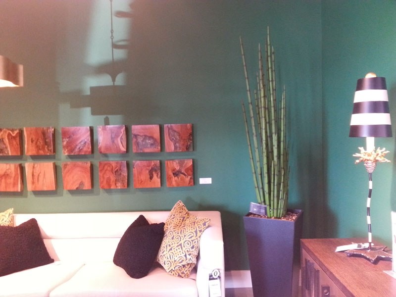
Tim Platten, design consultant with Christopher Clayton Furniture, says he also sees a strong use of vibrant colour (deep green, navy, yellows) to go with the mid-tone woods and largely mid-century modern décor in his showroom. Despite a move to simple, clean lines and contemporary furnishings, buyers always want to make a space warm and cosy with colour, a natural wood table top, or even textured, colourful light fixtures, he says.
Pantone's Greenery makes a versatile trans-seasonal shade, according to design experts, lending itself to many colour combinations of neutrals, brights, pastels and metallic – and even with the enduring popularity of the 2016 colours of the year, Rose Quartz (a muted blush-pink) and Serenity (a sky blue shade).
"Fresh whites with rose quartz – that's still a huge favourite with homeowners," adds Boser. "The sense is still simple, clean and bright, but the colour adds softness and warmth. A heavy use of whites and stainless steel can feel cold and sterile, so these colours used as accents become important in the overall feel of a space."