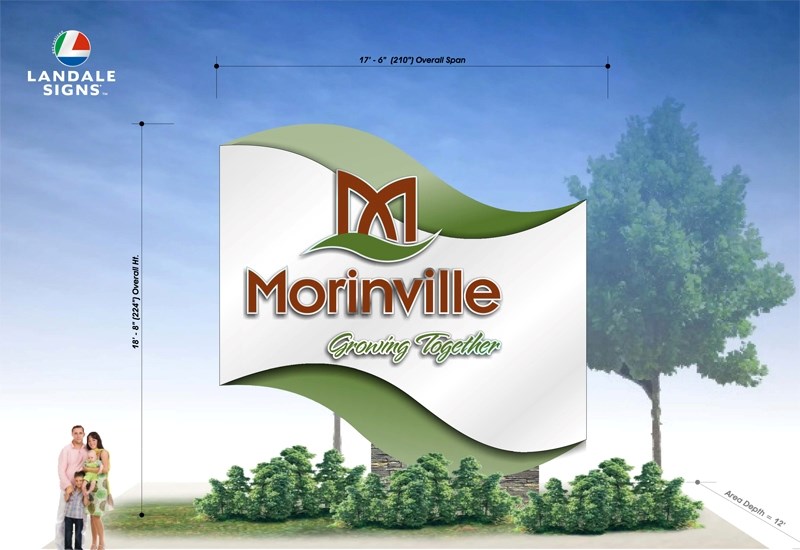
What should be the face of Morinville: a big wave or a big M?
Morinville town council is asking for the public’s help to pick a design for its new entrance signs.
The town plans to replace its four entrance signs and two secondary signs to reflect its new brand, said project manager Kim Wieringa, in her presentation to council Tuesday night. The current signs, which feature the town’s name and a picture of St. Jean Baptiste Church, are located at Cardiff Road and Highway 2 (site of a future overpass), on the north end of 100 Street and on the east and west ends of 100 Avenue.
Landale Signs won the bid to make the signs and submitted two designs. Option one features the town’s new logo — a stylized ‘M’ — its name and its slogan set against a wave-like structure. Option two features a much larger logo atop a rectangle with the name and slogan on it. The signs would be about 5.5 metres tall and five metres wide, with the Cardiff Road sign being the biggest of the four.
The signs turned out to be more expensive than expected, Wieringa said. Option one would cost about $131,600, while option two would cost $121,280. Since the town only has $75,000 in its budget for the signs, she recommended the town replace the smaller signs on the east and west side this year and replace the north and south ones in 2013. There’s no guarantee that the vendor won’t raise its prices by then, but if it did, the town could buy the signs from someone else.
The first two signs would go up this fall once Alberta Transportation approves the design, Wieringa said. They would also replace the amenities and community information signs on 100 Avenue with ones that reflect the new design.
Council held a secret ballot to pick a design for the new signs, but the vote was a tie since Coun. Nicole Boutestein was absent. Council asked administration to put both designs on the town’s website for a public vote. “We tied,” said Mayor Lloyd Bertschi, “so they can tell us which way they want to go.”
Residents can view the signs at www.morinville.ca, and should send their vote to [email protected] by June 20.
Bertschi said he was fine with either design, but wasn’t a fan of the big ‘M.’
“It looks too much like McDonald’s.”


